What contributes to the success of an e-commerce enterprise? A broad and diverse product range, multiple payment options, accessible and efficient customer service through various platforms, and punctual delivery?
Yes, all these factors play a significant role. But, equally important is an intuitive and aesthetically pleasing website, as it’s the user’s interaction with the site that can truly set you apart.
In this article, we will delve into the concept of user experience (UX) design, identify eight UX design blunders that can wreak havoc on an e-commerce business, and provide recommendations on how to prevent them. But first, let’s clarify what UX design means and outline its primary advantages for online businesses.
Understanding UX Design and Its Fundamental Principles

There are numerous interpretations of UX design. Simply put, every way you interact with software, whether it’s a website or a desktop/mobile application, from the number of clicks needed to reach a specific page to the positioning and size of a button within the browser window, forms part of user experience design.
Typically, users rate a software product higher if it’s…
… user-friendly
… visually appealing
… beneficial to them
A UX specialist’s objective should be to design an app or website that fulfills these basic criteria. In essence, the ultimate aim of a UX designer is to augment user satisfaction with a software product by enhancing its usability, accessibility, and appeal.
To realize this aim, UX designers should adhere to the following fundamental principles:
- Be human-centric. Software should be designed for people, not machines. Interactions with an app or website should resonate with humans. Computer language should be reserved for computers.
- Be straightforward. This implies maintaining uniformity in the design of website elements and highlighting the more important/less important elements through visual hierarchy.
- Be context-aware. Users should always know their position on a page or the entire site. Breadcrumb navigation is one way to provide this context. Be discoverable. If website content is not sorted into categories, sections, or other logical divisions, users will struggle to find the information they need. This discourages them from searching further on the site. It’s akin to a library where books are not arranged alphabetically.
- Be uncomplicated. There should be no diversions, i.e., anything that distracts a user’s attention from your primary action. This includes distracting fonts and colors, moving images, additional high-contrast CTAs, etc. Also, use simple language and avoid industry-specific jargon.
Violate any of these principles, and you enter the danger zone. Adhere to them, and your likelihood of success escalates. Here’s why.
The Impact of Effective UX Design on an Online Business

Boosting Conversion Rates
The online marketplace is fiercely competitive. Imagine you’re searching for a pair of shoes and come across two local websites selling footwear. On the first site, your search for a specific model turns into an ordeal. The website is disorganized and challenging to navigate, and the search results bear no relation to your query. In contrast, the second site immediately displays the exact model you’re looking for.
Which of these sites are you likely to patronize? The choice is clear, and other users would likely make the same decision.
Enhancing SEO Rankings
Google frequently updates its search algorithm, but one constant factor it values is user experience. As a company that cares about its reputation, Google prioritizes websites with superior UX design in its search results pages.
Generating More Leads and Maintaining Existing Customers
A user-friendly website doesn’t just attract new visitors. It also facilitates smooth interactions, helping businesses retain their existing customers. Effective UX design builds trust in a brand, service, or product, fostering long-term customer relationships. A loyal customer is a consistent revenue source.
To reap these benefits, pay close attention to your online store’s UX design and avoid common mistakes that contradict the principles discussed earlier.
Potential UX Design Pitfalls for Your Business
#1: Overly Long Forms
Forms can be an effective tool for gathering customer information. However, their usefulness depends on their purpose. If you need to ship a product to a customer, the form must collect sufficient details to ensure accurate delivery.
Conversely, if a customer is merely downloading an ebook, there’s no need for a physical address field. Remember: the more fields a user must complete, the more likely they are to abandon your site.
Recommended Actions
- Think carefully about what information you need from users when designing forms. Review each form and retain only the most relevant fields for each scenario.
- Ensure your form fields are sequential and organized. You can achieve this by categorizing them or arranging them in an ordered list.
- Consider using autocomplete features to simplify the form-filling process. This feature presents a list of options beneath an input field (like the Google search field), allowing users to select an option rather than typing out the full word or phrase. Other beneficial features include date pickers and dropdown menus.
Ultimately, use any strategy that minimizes the time users spend filling out forms.
#2: Excessive Textual Content

An online store is primarily for selling products or services, not reading. Overwhelming users with text can deter them, as they’re typically disinclined to read lengthy paragraphs.
Recommended Actions
- Reduce the amount of text on your website. Review all content and retain only what’s absolutely necessary.
- Use ordered or unordered lists instead of long passages.
- Avoid extending your text across the full width of the content section of a page. Ideally, a line of text should be no more than 60 characters long.
- Divide your text into small, digestible paragraphs. Research shows that people can retain between 5 to 9 items in their short-term memory. Beyond this, they can easily lose focus.
- Ensure your text is divided into paragraphs with a maximum of 9 lines each. Wherever possible, substitute text with visuals. A picture of a desired product is likely to prompt a purchase more effectively than a textual description would. Most people are visually oriented.
- In addition to photographs, consider incorporating infographics, videos, animations, and other visual elements. However, ensure these graphics are web-optimized as high-resolution images may significantly slow down page load times.
#3: The Overwhelming Onslaught of Popups
“Join us!” “40% off this July.” “Subscribe Now!” It’s incredibly frustrating when popups obscuring the content you want to see continuously appear with every link click. Popups are a leading contributor to high bounce rates.
Recommended Actions
Avoid irritating your customers with an excess of popups. Instead, locate an area on the page where they can appear without disrupting your visitors’ activities. Also, allow your users some time to engage with the content before presenting them with a popup request.
#4: Overcrowded Content With Minimal White Space
Attempting to pack too much content onto a single page without sufficient white space is ill-advised. It makes it difficult for visitors to distinguish between crucial elements and those of lesser importance. As a result, they may overlook key components like call-to-action buttons.
Recommended Actions
Ensure there is ample white space around elements to help your audience focus on the most important ones and prevent your page from looking cluttered.
#5: Inadequate Contrast
Low contrast between the background and text is a significant UX faux pas. While it might be used artistically in some scenarios, clear contrast is essential for product pages. This is especially true for online stores targeting seniors who often have compromised vision.
Recommended Actions
Experiment with various contrast settings to find the optimal one. Get feedback from friends and colleagues about the readability of your content. There are numerous online tools available to assist you in selecting the best contrast.
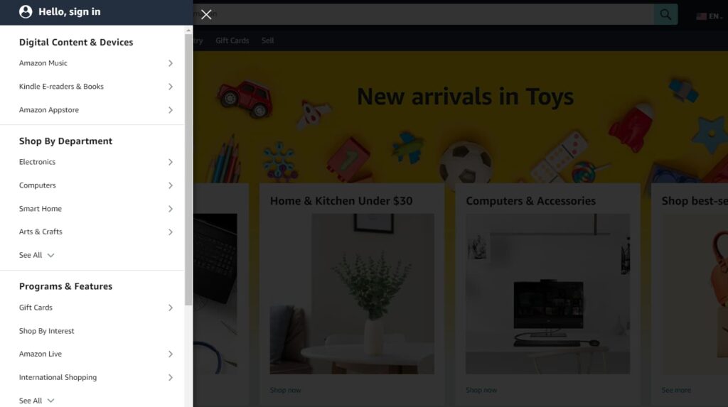
#6: Excessive Navigational Layers
While providing your current or potential customers with many options is good for business, it can adversely affect user experience. An abundance of menus and submenus can quickly overwhelm even the most patient visitors.
Recommended Actions
Ensure your most valuable offerings are easily accessible within a few clicks. Secondary or optional items should have their own dedicated area on your website. Make it easy for visitors to find what benefits them the most.
#7: A Jumble of Fonts and Colors
Remember, simplicity is key in UX design. An overabundance of colors and fonts can render a website confusing and divert attention from key actions you want users to take.
Recommended Actions
Restrict your color palette to two or three harmonious colors. You can use this tool to find the best color combinations. Limit yourself to a maximum of two consistent fonts throughout your site.
#8: An Unnoticeable CTA Button
The call-to-action button is arguably the most crucial element on an e-commerce website. It’s the click on this button that generates revenue for your company. However, it’s not uncommon to find websites where the CTA button is hardly noticeable, overshadowed by surrounding elements.
Recommended Actions
Ensure your CTA button stands out by selecting a unique color, design, and wording that distinguishes it from the rest of the page elements. The placement of this button is equally important.

Final Words
To sum up, enhancing user experience on your e-commerce website is a multi-faceted task that requires careful attention to several aspects.
Simplifying and optimizing form-filling processes, reducing text overload, wisely handling popups, providing ample white space, ensuring adequate contrast, minimizing complex navigational layers, practicing restraint with fonts and colors, and making your call-to-action button noticeable are all part and parcel of creating a user-friendly interface.
By addressing these key points, you can significantly reduce bounce rates, increase user engagement, and ultimately drive your online store’s profitability.